- How many calls are we handling?
- When are we busiest?
- What are people calling about?
- How well are our agents and flows performing?
- What outcomes and sentiments are our calls producing?
Overview and Controls
At the top of your dashboard, you’ll find global controls that determine what data you’re viewing. These filters ensure your analytics remain relevant and focused on specific agents, date ranges, or metrics.Selecting Agents
You can view performance data for one or multiple agents simultaneously.Each agent represents a distinct AI assistant with its own phone number, workflows, and call flows. To select agents:
- Click the Select Agents dropdown.
- Choose the agents you’d like to include.
- You can select all, deselect all, or focus on one specific agent.
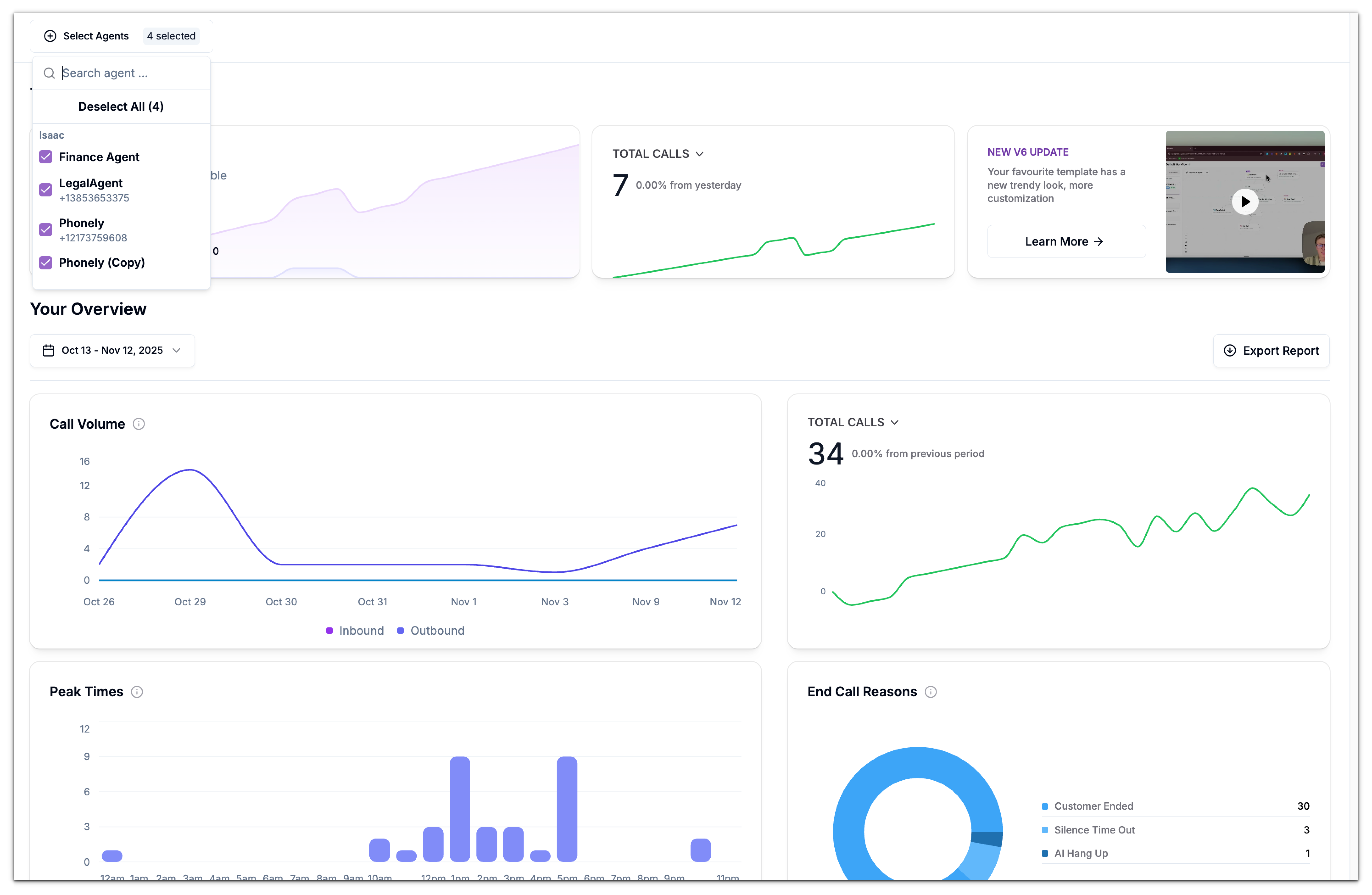
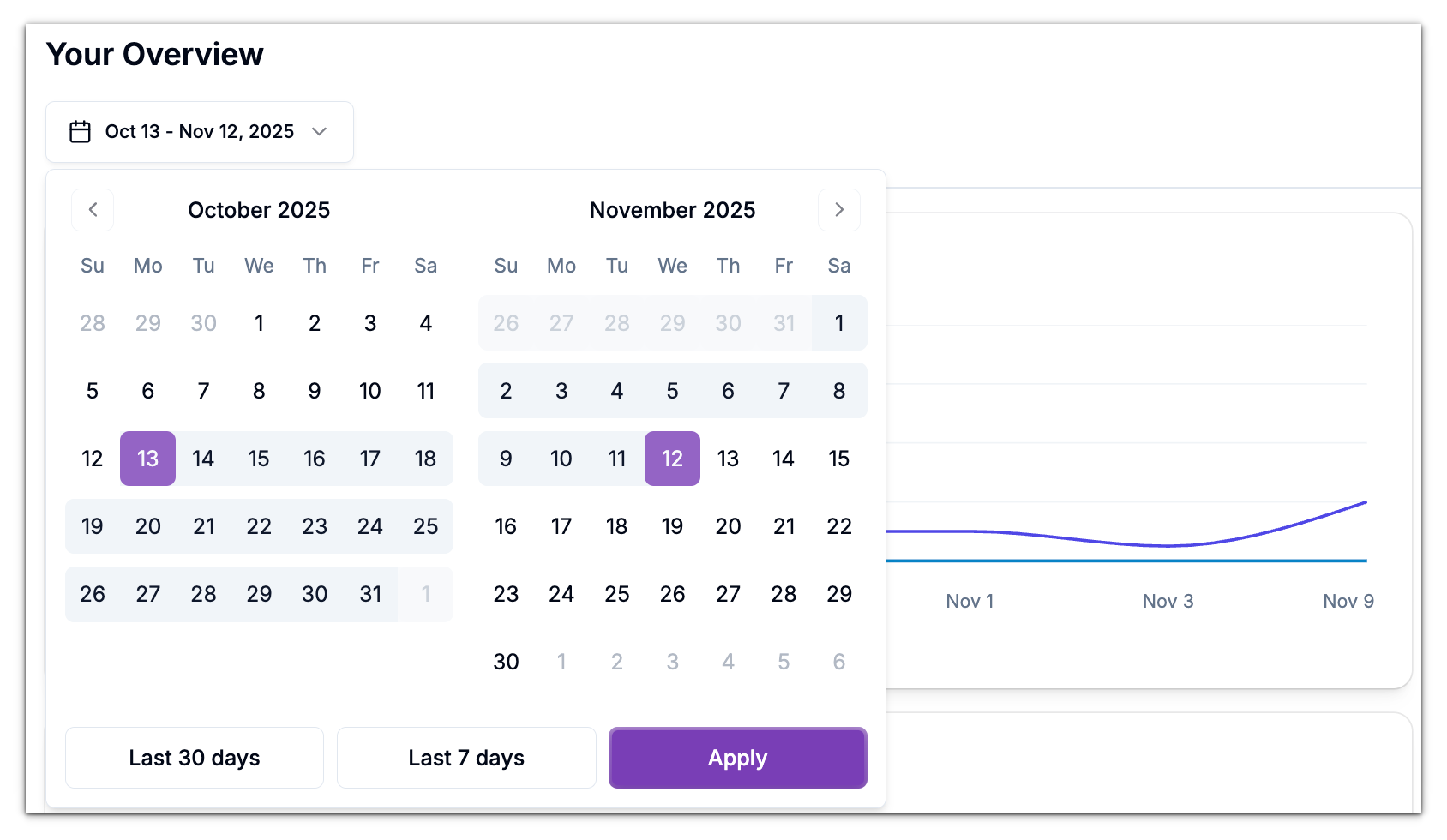
Choosing a Date Range
Under your overview section, you’ll see a date picker that lets you define the time period for your analytics. You can choose from:- Preset ranges like Last 7 Days or Last 30 Days, or
- Custom date ranges by clicking specific start and end dates on the calendar.
This flexibility helps you analyze trends over time, compare performance across weeks, or investigate specific events (e.g., a new campaign launch).
Filtering Metrics
Some widgets on the dashboard have their own filters, allowing you to focus on certain metrics or categories within the chart. For instance, in today’s metrics section under the second card, you can filter by Total Calls, Total Duration, Total Actions, Call Topics, and Call Out Comes.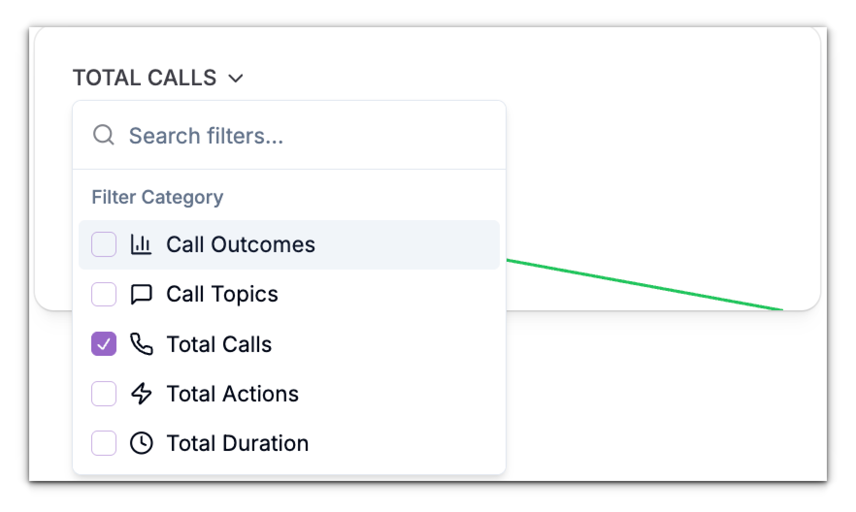
Today’s Metrics
The Today section of your dashboard gives you a quick, real-time snapshot of daily call activity. It’s designed for teams that need an immediate view of what’s happening now, without filtering through larger time ranges. This view is refreshed continuously throughout the day and includes only calls that occurred within the current calendar day.Call Volume
The Call Volume card displays the total number of calls handled by your agents today.It breaks down into:
- Inbound Calls: Calls received by your agents.
- Outbound Calls: Calls initiated by your agents (e.g., through outbound campaigns or redial flows).
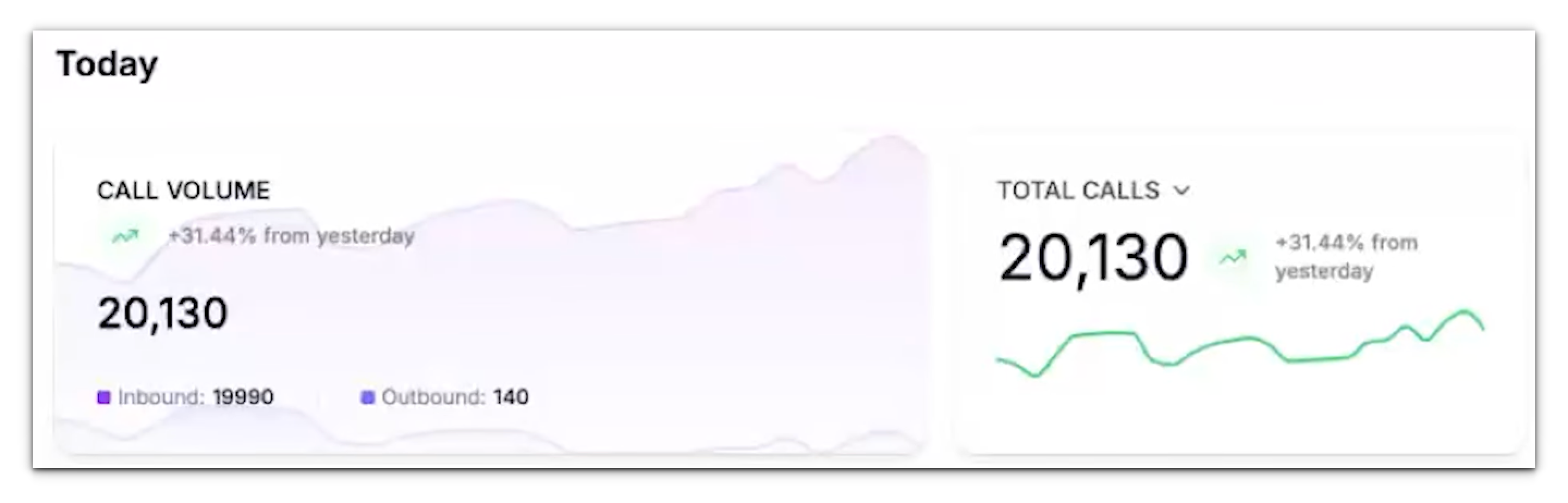
For example, a gradual rise in the inbound curve means your team is receiving calls consistently, while spikes indicate busy periods.
Call Insights - Call Topics , Outcomes & Total Calls, Actions and Duration
This card provides a snapshot of today’s call metrics, helping you understand what’s happening in real time. This card can display one of several metrics, controlled by the dropdown menu in the card header. Click the chevron and choose what you want to see:- Call Outcomes – Trend of resolved, missed, transferred, voicemail, etc.
- Call Topics – Count of categorized topics (e.g., Appointment Request, Billing Inquiry, Support Ticket) detected by Phonely’s AI from call transcripts.
- Total Calls – Total number of calls in the last 24 hours.
- Total Actions – Number of in-flow actions performed by agents/flows (e.g., send SMS/email, transfer, API call).
- Total Duration – Aggregate talk time for the selected period.
Periodic Metrics
Call Volume
The Call Volume chart tracks the total number of calls made and received by Phonely during the selected period. It distinguishes between:- Inbound calls (received by your agents) and
- Outbound calls (initiated by your agents).
- A sudden drop in inbound calls might indicate routing issues or downtime.
- A sudden drop in outbound calls might indicate routing issues or downtime.
- A sharp increase may reflect a successful campaign or seasonal surge.

Peak Times
The Peak Times section identifies when most calls occur during the day.Each bar represents an hour block, helping you pinpoint your busiest hours.
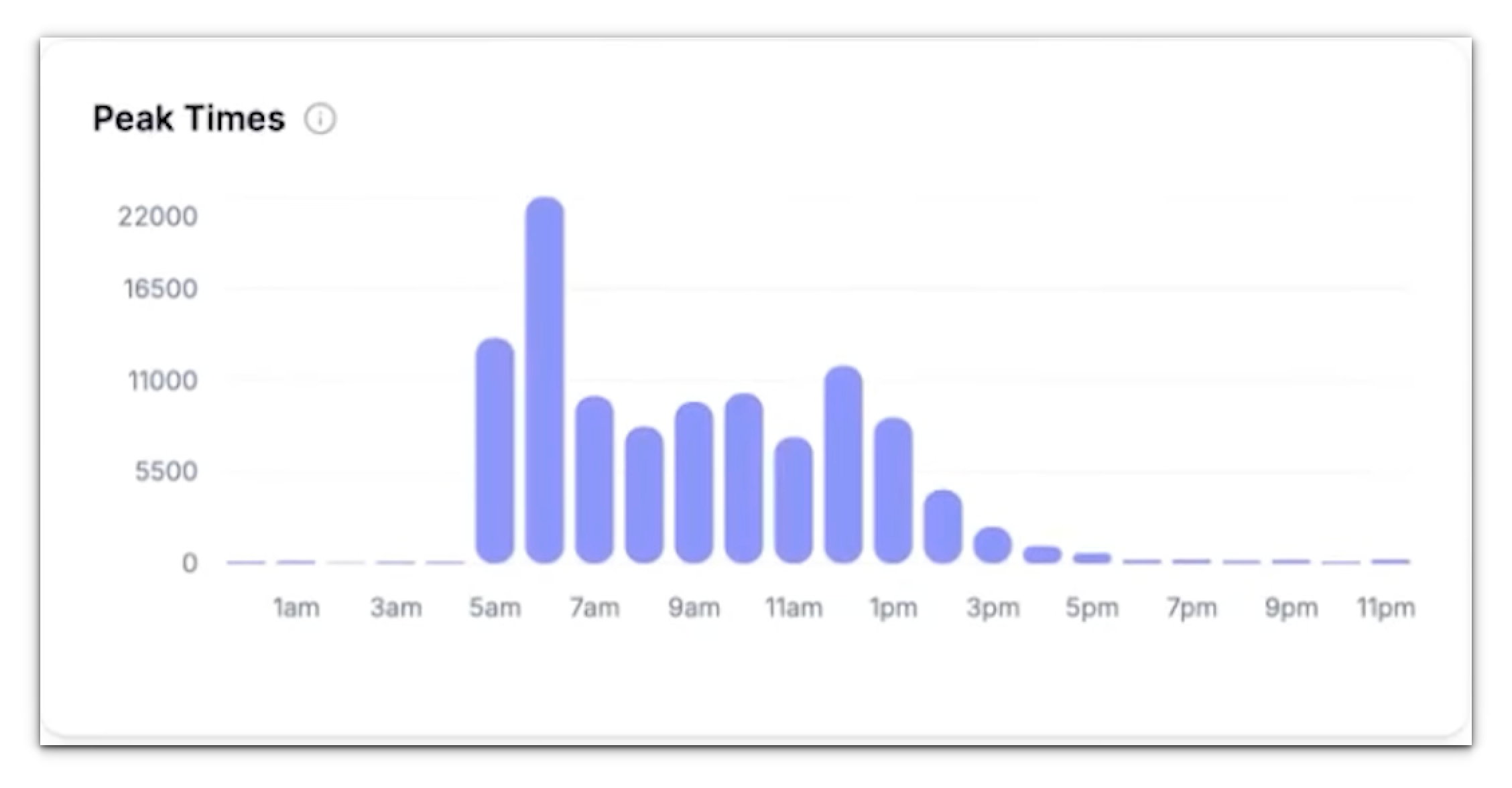
- Scheduling live monitoring or human backup during high-traffic periods.
- Timing outbound campaigns for maximum engagement.
- Adjusting flow logic or call distribution to balance workloads.
End Call Reasons
The End Call Reasons widget automatically categorizes why each call ended.Common end reasons include:
- Customer Ended – The caller hung up intentionally.
- Silence Timeout – The call ended because there was no activity for a set duration.
- Agent Ended – Phonely or your AI flow ended the call based on logic or timeout.
- Transfer or Voicemail – The call was redirected or logged to voicemail.

Call Topics
The Call Topics section organizes calls by detected intent or purpose.Phonely uses natural language understanding to interpret what each call was about.

- Understand what’s driving your call volume.
- See how well your routing or automation aligns with real customer needs.
- Identify new opportunities for automation or FAQs.
Call Actions
Call Actions represent the most common steps or automations your agents triggered during calls.These actions could include:
- Sending follow-up emails or SMS messages.
- Creating or updating records in connected systems (like Google Sheets or Zapier).
- Running code blocks or transferring calls.
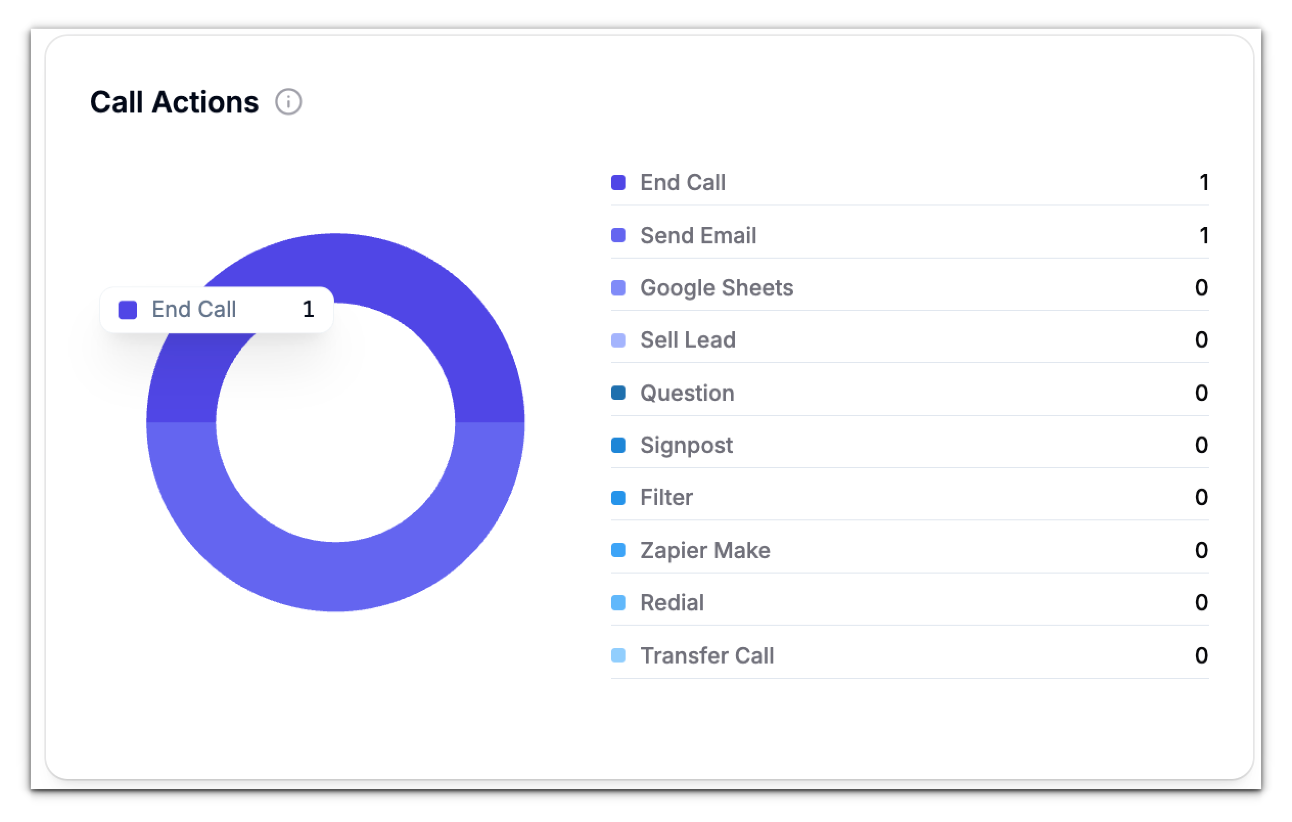
It’s an excellent indicator of workflow effectiveness, if a critical action rarely appears, it might mean users aren’t reaching that stage or an integration isn’t firing properly.
Call Outcomes
Call Outcomes summarize what happened at the end of each call.Unlike “End Call Reasons” (which describe how the call technically ended), outcomes describe the business result. Examples of call outcomes:
- Appointment booked
- Issue resolved
- Payment collected
- Lead qualified
- No answer
Monitoring trends in call outcomes also helps you evaluate changes over time - for example, after tweaking scripts or updating your AI prompts.
Call Sentiment
The Call Sentiment section analyzes caller emotions and tone throughout the conversation.Each call is categorized as Positive, Neutral, or Negative based on the caller’s language and sentiment. This insight helps you gauge customer satisfaction without manually reviewing transcripts.
If you notice a rise in negative sentiment, it could indicate a confusing workflow, an unhelpful agent tone, or recurring product issues. On the other hand, consistently positive sentiments is a strong indicator that your AI agent are providing effective support.
Agent Breakdown
The Agent Breakdown chart compares performance across all active agents.You can toggle between several views:
- Inbound – Total received calls per agent.
- Outbound – Total outgoing calls per agent.
- Duration – Average or total talk time per agent.
- Action – Distribution of triggered actions per agent.
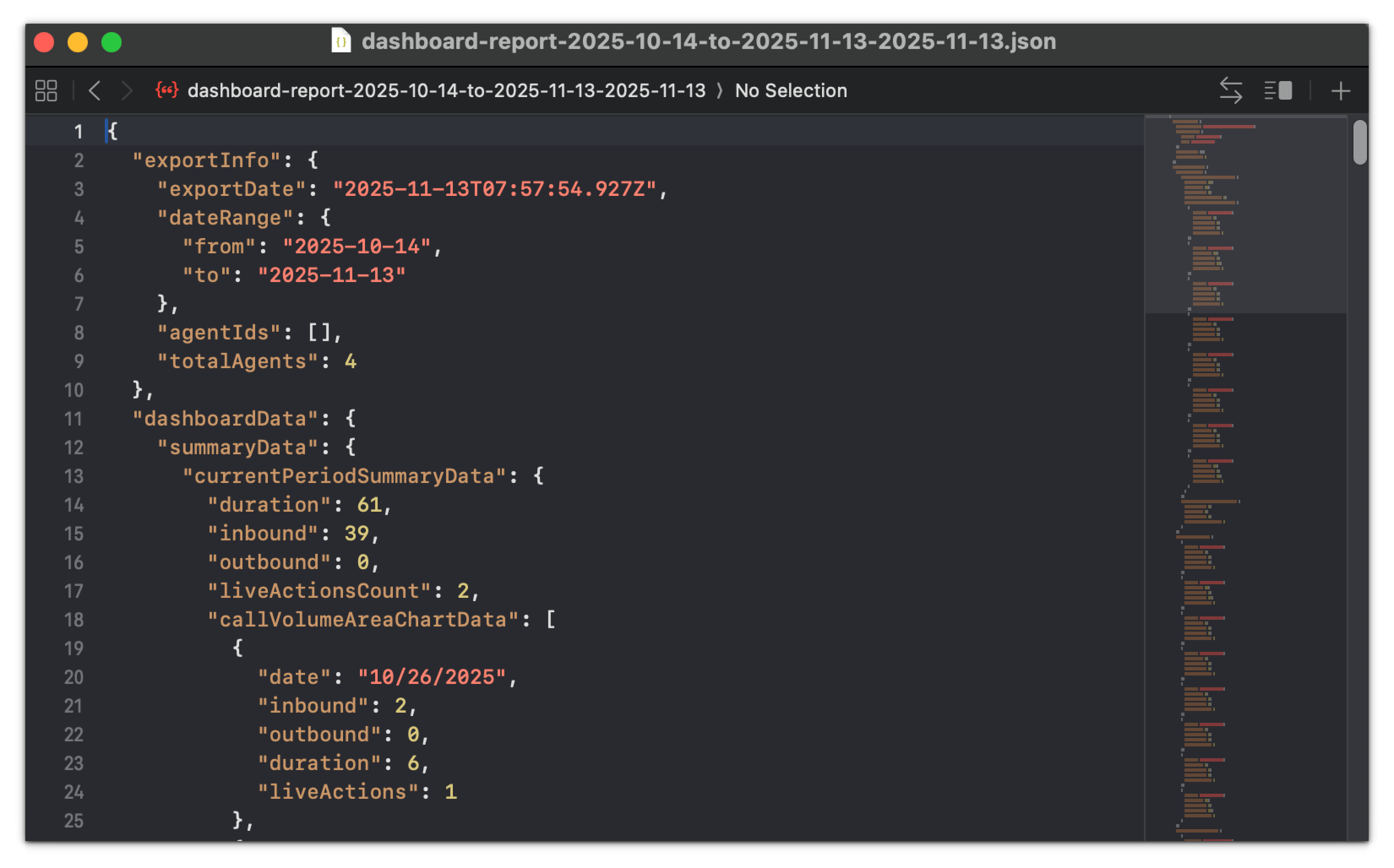
Exporting Reports
Once you’ve applied your desired filters and date range, click Export Report in the top-right corner.This generates a detailed report you can share with your team or management.
Exports are ideal for weekly reviews, quarterly reports, or comparing campaign performance.