From the left sidebar:
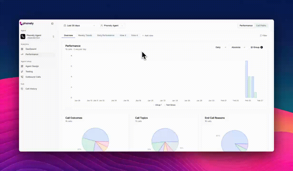
- Go to the Analytics section.
- Select Performance.
- Performance – high-level analytics and trends
- Call Paths – a visual view of how calls move through your workflows
Page layout
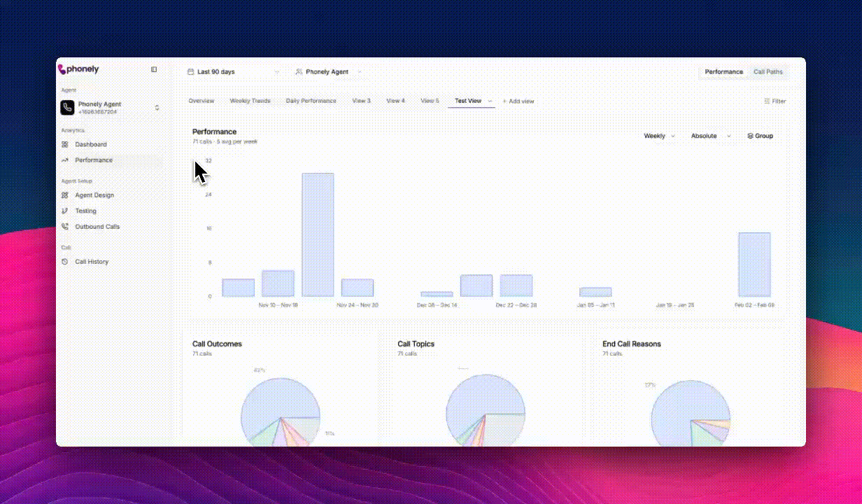
The performance page is organized into a few key sections:Views
Predefined views such as overview, weekly trends, and daily performance are available by default. These views can be customized. You can also create additional custom views for more tailored analysis.
Controls
The top controls let you define which data you’re viewing and how it’s organized before diving into the charts.Date range selector
Use the date range dropdown to control the time period included in all charts and metrics on the page. Preset ranges include: Last 24 hours, Last 7 days, Last 30 days, or Last 90 days If you need a specific window of time, switch to Custom to select exact start and end dates.Agent selector
The agent selector lets you choose which agent’s performance data is displayed. Includes a Search agents… field for quick lookup. All charts and breakdowns update instantly when you change the selected agent.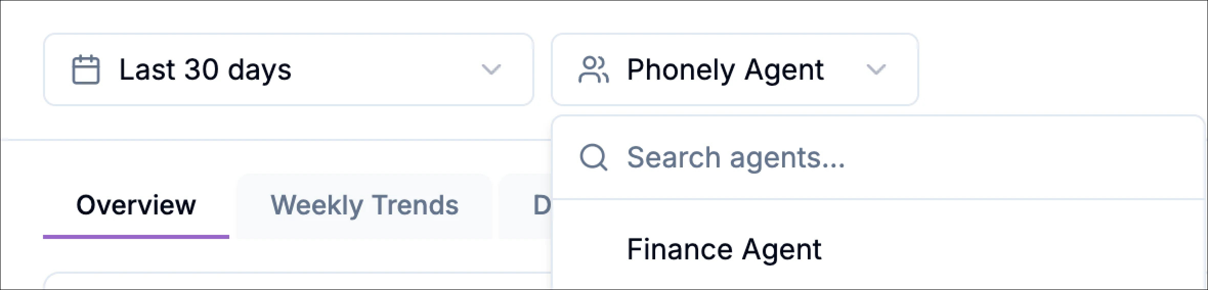
Views
Views control how performance data is grouped, filtered, and visualized on the performance page. They let you shape your analytics workspace around the questions you want to answer, whether that’s monitoring overall efficiency, tracking trends over time, or drilling into specific outcomes. You can save multiple perfomance views and switch between them instantly, no need to reset filters or charts each time. For example, create and reuse views for:- Transfer rate
- Containment rate
- Custom outcome-based reporting
Filters
Filters allow you to narrow down the calls included in your performance charts, helping you focus on specific scenarios, outcomes, or behaviors. To access filters, click Filter in the top-right corner of the performance chart area.This opens a slide-out panel containing all available filtering options. The filters panel controls which calls are included in the charts and breakdowns.
Each filter group displays:
- A list of available values
- The number of calls associated with each value
- A select all option for quick selection
Available filter categories
The following filter groups are available:
- Click Apply to update the charts using your selected filters
- Click Cancel to close the panel without making changes
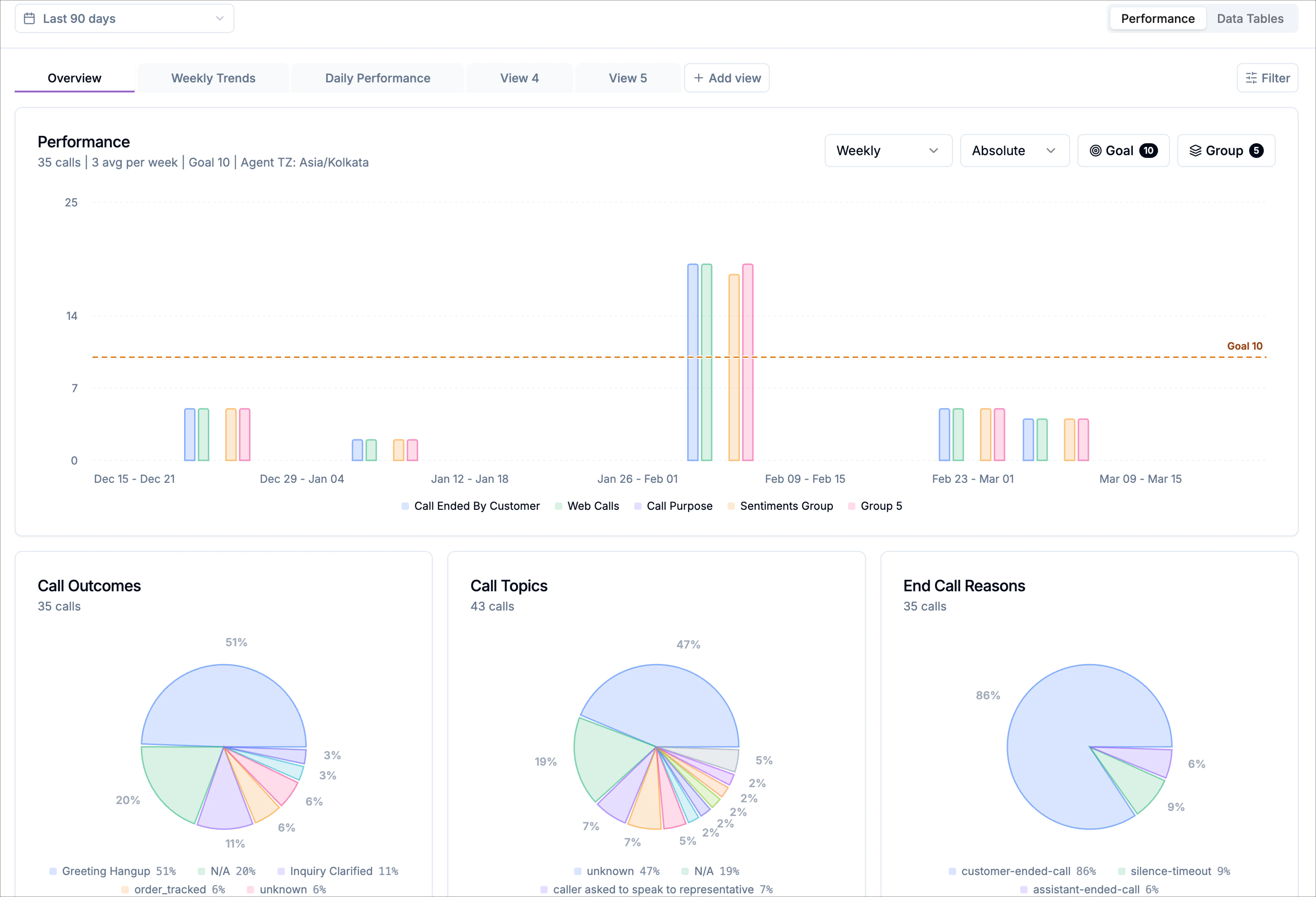
Performance charts
The performance chart is the primary visualization on the page. It shows how call volume changes over time based on your selected configuration. The chart automatically reflects the currently selected: date range, agent, view, or filters In the top-left corner of the chart, you’ll see a quick summary that includes:- Total calls within the selected date range
- Average calls per day, calculated across the displayed period
Chart controls
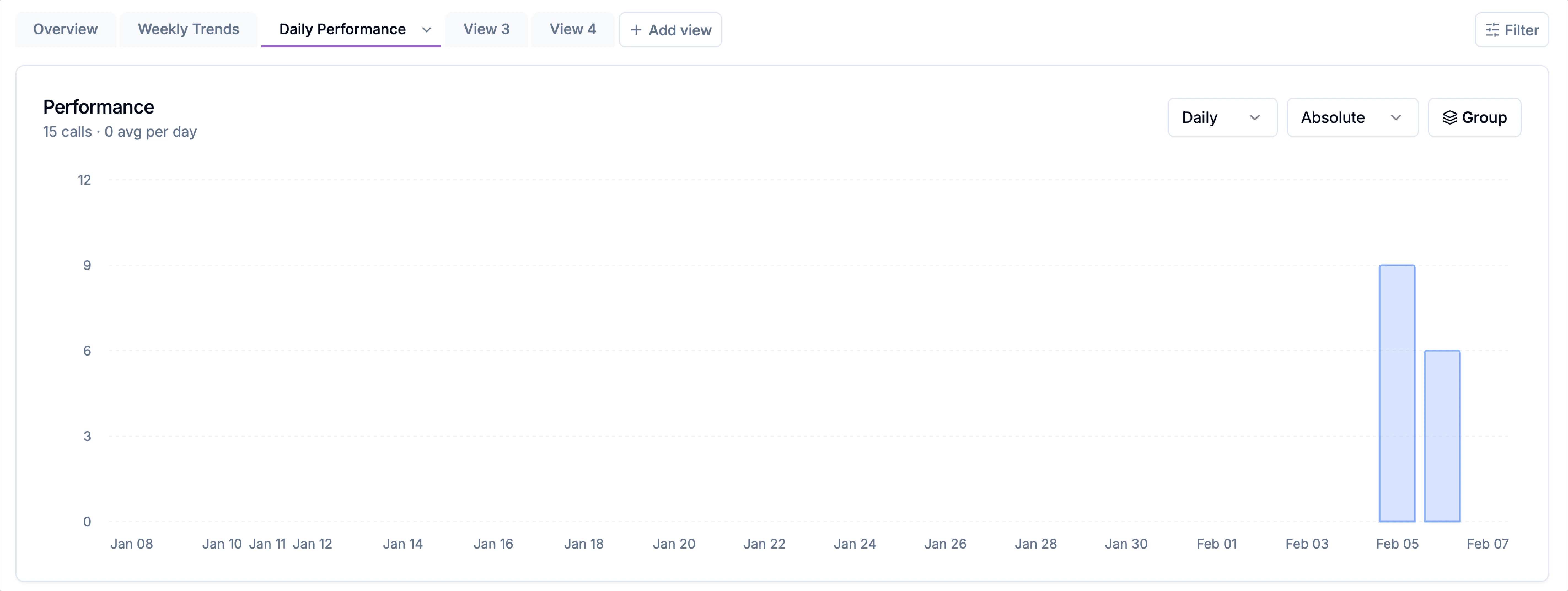
The controls in the top-right corner of the chart allow you to customize how data is displayed.Time granularity
Use the dropdown to control how call data is grouped over time. You can switch between:- Daily - Displays the average calls per day.
- Weekly - Displays the average calls per week.
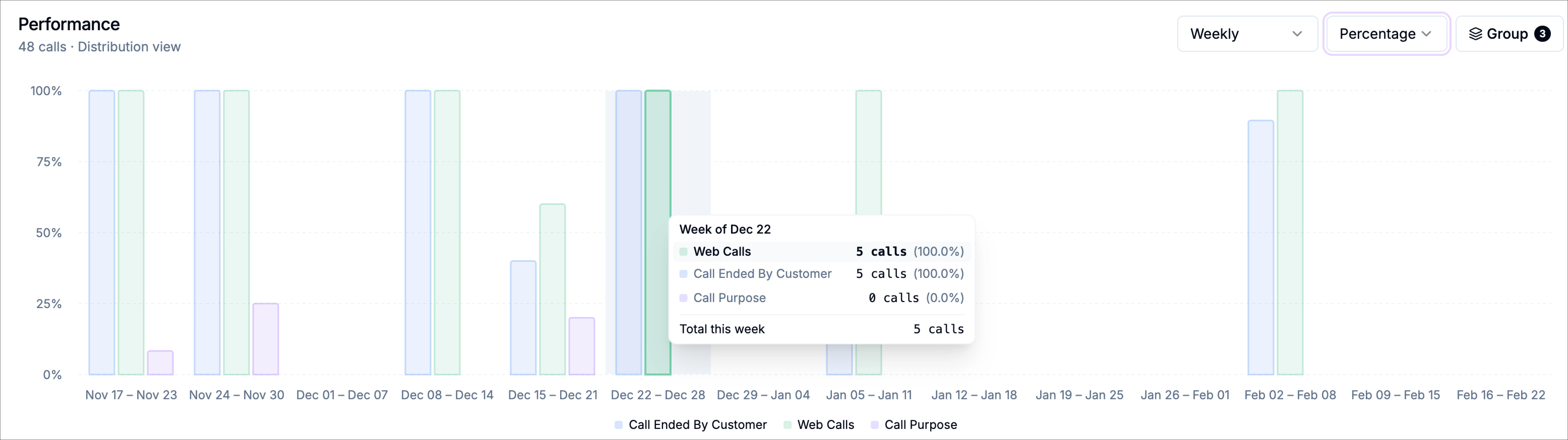
Measurement mode
Use the measurement dropdown to switch between:- Absolute – Displays raw call counts
- Percentage – Displays each category as a percentage of total calls
Goal
Use goal to add a target line to the chart. When enabled, the chart displays a horizontal dashed line showing the selected target value. This makes it easier to compare actual performance against your expected call volume. When a goal is active, the goal button shows a badge indicating the current target value. This means the chart is displaying a target of 10 calls for each bar in the chart. To configure a goal:- Click Goal in the chart controls.
- In the target panel, enter the number of calls you want to use as the target.
- You can also use the Quick set options to apply a preset value such as 25, 50, 100, or 250.
- Click Apply to update the chart.
- The target line appears across the chart
- The target label appears on the right side of the chart
- The summary above the chart reflects the active goal value
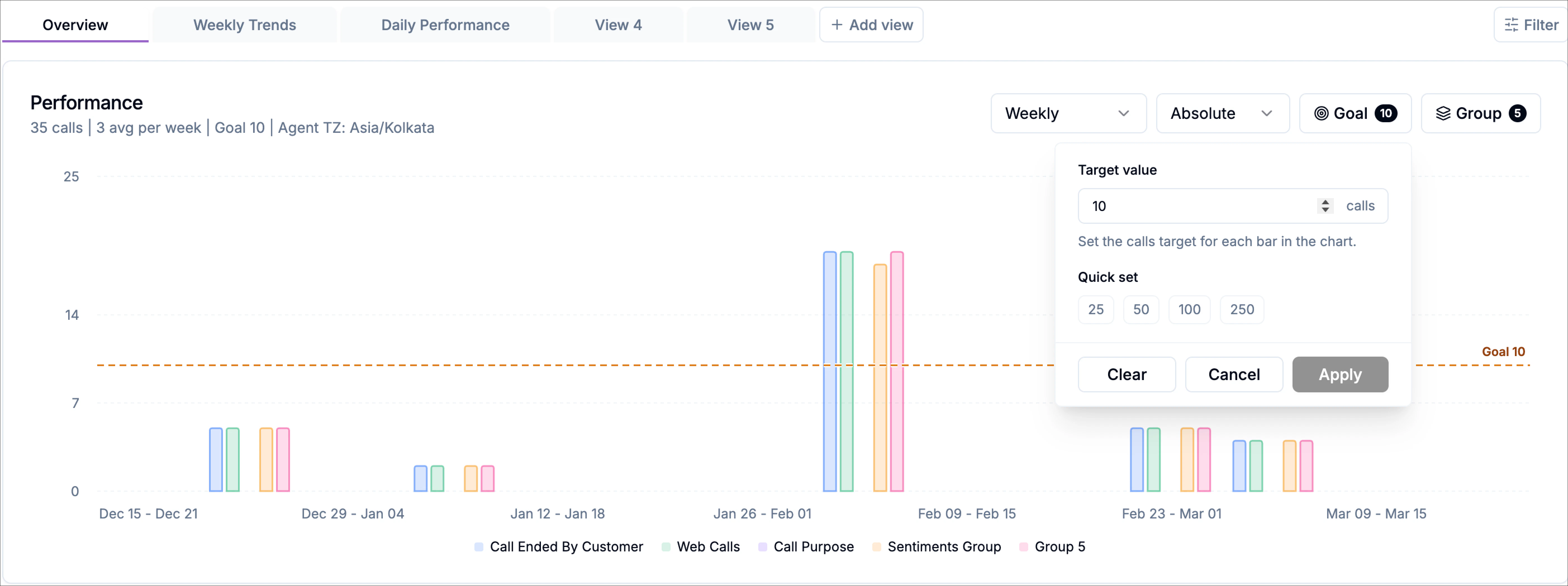
Clearing or changing a target
Inside the target panel:- Clear removes the current target
- Cancel closes the panel without applying changes
- Apply saves the target value and updates the chart
Grouping
Click Group to split the chart into multiple categories, displayed as stacked or grouped bars instead of a single total. When grouping is active, the button shows a badge (for example, 3) indicating how many groups are currently configured.Hover tooltips
Hovering over a bar reveals a detailed tooltip that provides deeper insight into that data point, including:- The specific date
- Call count for each configured group
- Percentage contribution of each group
- Total number of calls for that day/week
Grouping with Category Groups
Category groups let you organize related values into custom buckets, making it easier to compare meaningful segments instead of individual data points. For example, you may want to understand what percentage of your total conversations result in appointments being booked. To do this, you create two groups:- Group 1: Appointments Booked
Includes end reason: appointment booked - Group 2: Total Conversations
Includes all end reasons
- Click Group in the chart controls.
- The Category Groups modal opens.
- Click + Add Group to create a new group.
Group name
Provide a clear, descriptive name for the group. By default, groups are labeled Group 1, Group 2, and so on, but you can rename them to match your reporting needs (for example, Successful Calls, Escalations, or Drop-offs).Group type
Choose what dimension the group is based on. Available options include: call outcome, call topic, end reason, status, call type, sentiment. This determines which values are available for selection within the group.Group values
Select the specific values that belong in the group.Each value displays the number of calls associated with it, helping you understand its impact before adding it. You can include multiple values in a single group. The interface shows how many values are currently selected. At the bottom of the modal:
- Apply updates the chart using your grouping configuration
- Cancel closes the modal without saving changes
- Clear All removes all group selections (when available)
- Use the trash icon next to a group to remove it.
Call Charts
At the bottom of the Overview tab, you’ll find a set of breakdown charts that summarize how calls are distributed for the selected date range, agent, and filters. These charts provide an at-a-glance view of call behavior without needing to drill into individual records.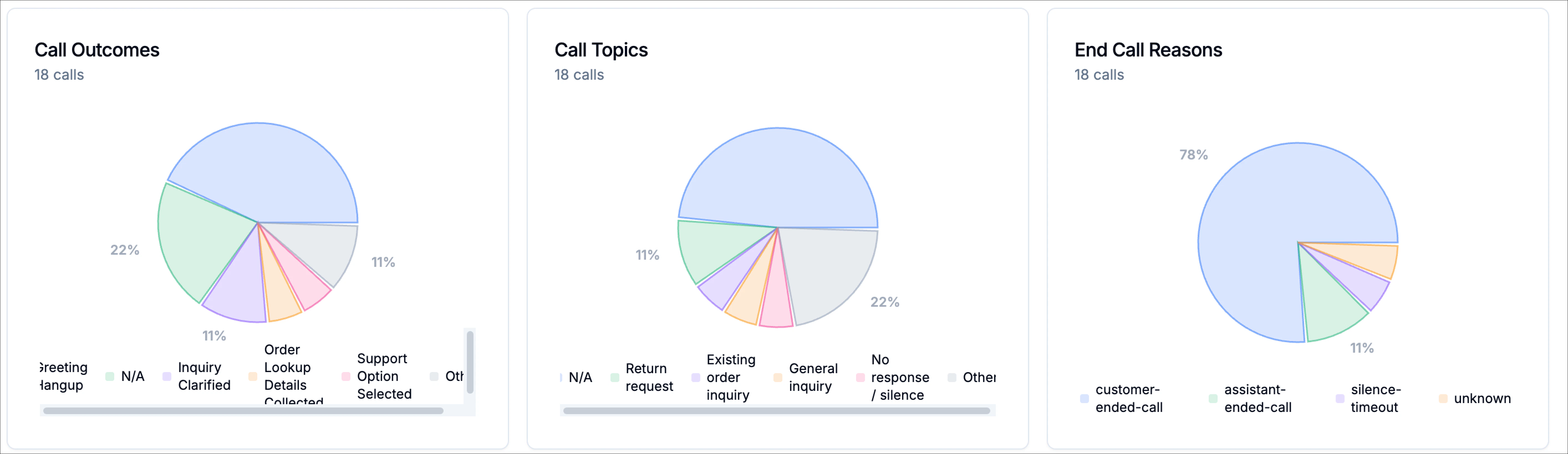
Call Outcomes
This chart shows how calls are categorized by outcome, helping you understand what your agent is successfully accomplishing (for example, completed tasks, clarifications, or hang-ups).Call Topics
This chart highlights the topics callers are reaching out about most often, giving you insight into common intents and areas of demand.End Call Reasons
This chart breaks down how calls concluded, such as whether the call was ended by the caller, the assistant, or another system condition. Each breakdown card displays the total number of calls included in that category, making it easy to compare volumes across categories at a glance. These charts aren’t just visual summaries, they’re fully interactive.- Click any slice of the chart (for example, customer-ended calls or forwarded calls at 3:00 PM)
- A slide-in panel opens from the right
- You’ll see the exact calls behind that data point, including the call summaries, timestamps, durations, and detected topics or outcomes.
Want to compare forwarded calls vs calls that reached the end?
Want to define your own success metric and see how it trends over time?
Done, and you can always click through to review the real conversations behind the numbers.
